Customizing your donut chart
Once you have uploaded your dataset into Datawrapper and selected the donut chart, you can customize its appearance in step 3: Visualize.
The first thing you will notice is that the donut chart might be too small. You have two options to resize the chart, either through resizing using your mouse or by specifying the exact size you want:
- Click, hold, and drag the resize arrow in the bottom right corner of the chart:

- specify the exact size of the chart by defining the height and width in pixels with the help of the boxes below the chart:


Refine
In the "Refine" tab, you'll see some options in four groups: Donut slices, Labels, Color Key and Grouping. Let's go through all four groups, step by step:

- Select column: Here you can choose the column that you want to visualize. By default, your first numerical column is chosen. Please note: Your donut chart can only show one numerical column. If you've uploaded more than one column with numbers and want to show all, choose the "Multiple Donuts" chart type instead.
- Slice color: Click on "customize colors" and then select each element to give each slice a specific color.
- Outer radius: You can decide how much margin your donut should have to all sides with this setting. Choose a small percentage to keep the total chart height small.
- Inner radius: Here you can choose if you want your donut rather thin or thick.
- Sort by: By default, the slices in your donut are sorted from largest to smallest value. So even if your original values are not sorted, the final donut chart is. You can click on "keep order" if you want to have your donut slices sorted according to you original values.


- Number format: This dropdown menu has multiple options. They will be especially important in case your numbers are very "long" (e.g. 1,992,394 or 0.4239291) and you want to display them abbreviated (e.g. 1.9m or 0.424). Choose e.g. "123.4k" to turn 1,992,394 into 1.9m.
- Convert values to percentages: You can upload absolute relative or absolute numbers to Datawrapper to create a donut chart. In case you uploaded absolute numbers (like we did for the chart above) and want to show percentages, make sure to enable this option.
- Inside labels and Outside Labels: There are two ways to display labels: Inside the donut slices or outside the donut slices. You can click on the little grey or blue switch to turn these options on and off. Inside these options hide some ways to style the labels, like "Show labels" or "Use slice color for labels":
 Inside labels with "Show labels" and "Show values" turned on, and color key enabled (scroll down to learn more about how to enable the color key)
 Outside labels with "Show values" turned on. The color key disabled itself automatically when you turn outside
labels, since the available space wouldn't be enough to show both the outside labels and the color key.
- Show value inside donut: You can display a value inside the donut hole. The first option is to show the sum of all pie slice values (if you uploaded relative numbers, that number should be 100%). Or you can decide to emphasize the value of one donut slice by choosing "Show single". Finally there is the option of showing custom text, if you do not want to use any values from the dataset.
 Inside labels with "Show labels" and "Show values" turned on, and color key enabled (scroll down to learn more about how to enable the color key)
 Outside labels with "Show values" turned on. The color key disabled itself automatically when you turn outside

If you enable the color key, you'll see the names of your donut slices listed in your chart:

- Position: You can decide if your color key should be at the top, bottom, left or right of your chart.
- Stack labels: Instead of listing the donut slice names next to each, you can stack these labels. That's only possible if "position" is either "top" or "bottom".
- Show values: Click if you want to include the values of each slice in the color key (as in the example above).
 The last group in the Refine tab is "Grouping". If you upload more than seven donut slices, the smallest donut slices will be automatically grouped in one slice with a label. Here you can define that maximum number of slices, and what that slice label should be.
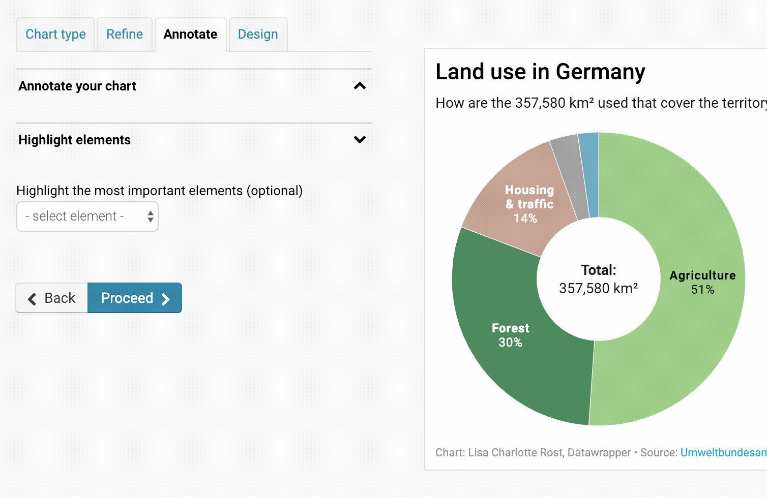
Annotate
In the Annotate tab, you're first asked to give your visualization a title, description, notes, source, byline, and an alternative description for screen readers. You can find a detailed explanation of all these Annotate options here.
Highlight element
In the 2nd panel in the "Annotate" tab, we can emphasize certain donut slices. All the other donut slices will then tone down in their color compared to the highlighted one. To remove the highlight feature from the donut chart, click on the little "x" left of the text in the blue button:
Layout
In the Layout tab, you can select an output locale, change the design theme and footer options, and enable social sharing. Find a detailed explanation of all the Layout options here.
Publish
In the final step 4: Publish & Embed, you have the option to publish the chart either by sharing the URL or by copying the embed code directly on your website or CMS (recommended). You can also download your chart as a PNG (available to all users regardless of the type of subscription plan they have) or as a PDF or SVG file (available only to users of Custom or Enterprise plan). For more information on the different pricing plans, click here.